
Het echte verhaal achter het Apple logo
Het eerste logo van Apple werd gemaakt door Ron Wayne, maar was een kort leven beschoren. Want de tekening van Isaac Newton onder een boom was misschien mooi, maar als logo eigenlijk onbruikbaar. Want een goed logo moet ook klein en goed te gebruiken zijn, want vooral dan zie je of een logo overeind blijft of niet.

Maar dat was waarschijnlijk niet de enige reden dat Steve Jobs al vrij snel op zoek ging naar een ander logo. Want bij de briefing voor het nieuwe logo maakte hij waarschijnlijk duidelijk wat hem ook dwars zat bij het oude logo. Want die briefing was, zoals we van Steve gewend zijn, kort en krachtig: "don't make it cute".
Die briefing was aan Rob Janoff, die op dat moment werkte als art director bij Regis McKenna, een bureau voor reclame en public relations.
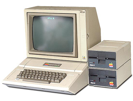
Dat nieuwe logo moest nog aan een paar andere dingen voldoen, het belangrijkst was waarschijnlijk dat het moest komen te staan op de Apple II. Als je die hieronder ziet wordt het ook al snel duidelijk dat het originele logo hier niet op had gepast.
Later is er heel erg veel gezien in dat logo van de appel met de hap eruit en de regenboog. Jean Louis Gassée zei bijvoorbeeld daarover het volgende:
One of the deep mysteries to me is our logo, the symbol of lust and knowledge, bitten into, all crossed with the colors of the rainbow in the wrong order. You couldn't dream of a more appropriate logo: lust, knowledge, hope, and anarchy.
daarbij is het aan dit logo nog veel toegedicht, zo zou de hap eruit een toespeling zijn op een byte, en dus een leuke woordspeling in beeld zijn.
Rob Janoff maakt een eind aan al dit soort speculaties:
Do the colors represent the hippy culture, which was in fashion at the time?
Partially it was a really big influence. Both Steve and I came from that place, but the real solid reason for the stripes was that the Apple II was the first home or personal computer that could reproduce images on the monitor in color. So it represents color bars on the screen. Also, it was an attempt to make the logo very accessible to everyone, especially to young people so that Steve could get them into schools.
At the time most logos were single color or 2 color logos. Anybody fight against the color stripes?
Steve liked the idea, because he liked things that were outside the box. And, it's not so revolutionary now, but it was a little different then.
Natuurlijk werden er meer versie gepresenteerd, maar Rob Janoff's favoriet was duidelijk de versie met de regenboog en de hap eruit.
How many versions did you do for the presentation?
We presented two versions of the logo. One with and one without the bite. Just in case he thought the bite was too cute. Fortunately he went with the one that gave it the most personality with the bite. Frankly it was a no brainer and you would miss the mark if you don't show some kind of an apple. When I presented I showed him several variations. Striped version, solid color version, metallic version. All those with the same shape.
Wil je het hele interview met Rob Janoff lezen, dat kan
op deze pagina van Creativebits.org.